Blog

  • Nail Art Tools I Actually Use: My Hands-On, Messy, Happy Review

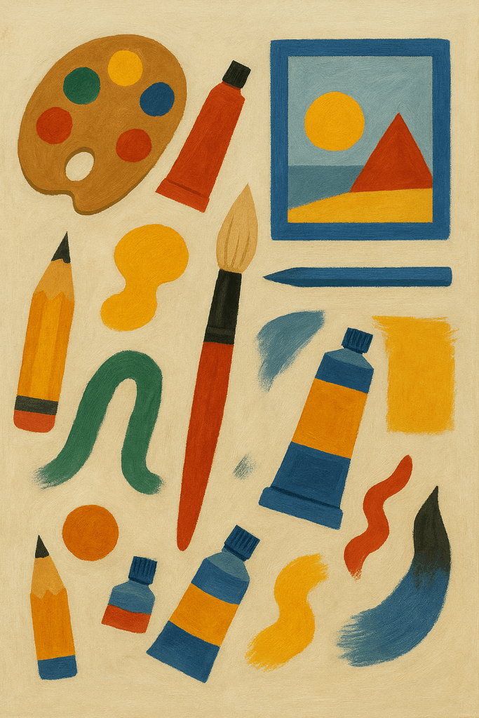
    I do my nails at my kitchen table. There’s a tea mug on the left, a little acetone pump on the right, and a cat who thinks rhinestones are toys. So yeah—tools matter. The right ones make the mess small and the lines clean. The wrong ones make me grumpy.

    You know what? I’ve tried a bunch. (I also put together a photo-heavy version of this rundown over on Metro Arts—find it here.) Some I love. Some I use only when nothing else is clean. Here’s what’s real for me.

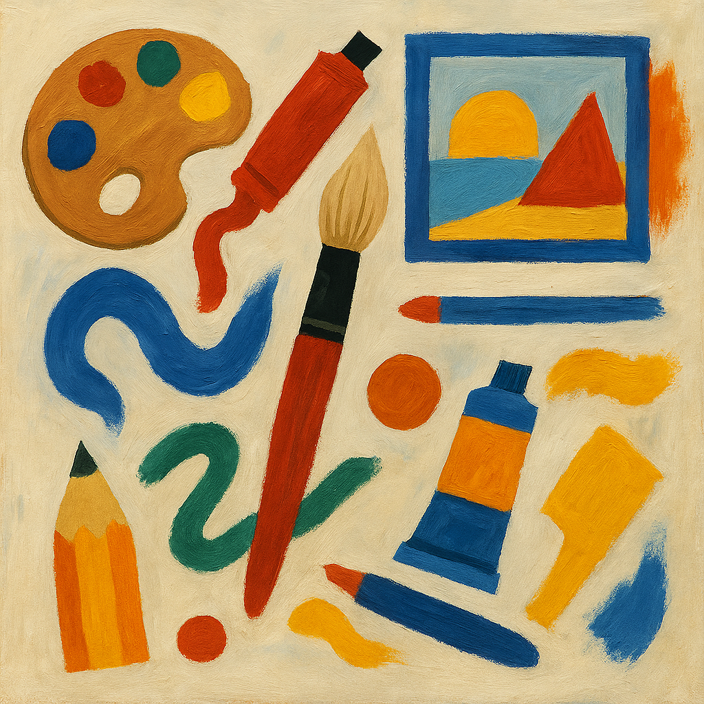
    What’s in my kit right now

    • SUNUV SUN2C UV/LED lamp
    • Beetles 5pcs Nail Art Liner Brushes
    • Makartt dual-ended dotting tools
    • MoYou London stamping plates + Clear Jelly Stamper Big Bling
    • Born Pretty Nail Foil Glue + assorted foils
    • PUEEN Latex Tape (peel-off barrier)
    • MelodySusie Scarlet nail drill (with ceramic medium bit)
    • OPI crystal nail file + metal cuticle pusher
    • KADS clean-up brush (size 2)
    • Wax pencil and tweezers for rhinestones
    • Striping tape (various brands)
    • Makeup sponges from the drugstore
    • A cheap bead organizer for studs, charms, and loose glitter

    It looks like a lot. It didn’t start that way. I added one tool at a time, usually after a small fail and a laugh.

    The tools I reach for the most

    Liner brushes (Beetles)

    These are my workhorses. The 7mm and 11mm brushes draw thin lines without the hair splaying out. I use them for French tips, candy cane stripes, and tiny vines. I clean them with a bit of base gel, not acetone, so they last longer. Little trick I picked up after ruining two brushes in a week. If you're still figuring out how to load, angle, and clean detail brushes, check out this walkthrough from Maniology.

    Pros: thin lines, easy control, easy to wipe.
    Con: caps feel loose; I tape mine.

    Dotting tools (Makartt)

    Flowers. Polka dots. Bubbles. I use two sizes on one nail so dots don’t look flat. For my son’s soccer game, I did blue and white dots in three sizes. He called them “confetti nails.” It took ten minutes. Kids are blunt, so that meant a lot.

    Pros: five sizes, wipe clean fast.
    Con: chrome ends can get slippery with lotion. I wrap a bit of washi tape for grip.

    Clear stamper + MoYou London plates

    Stamping felt like magic, then chaos, then magic again. My Clear Jelly Stamper Big Bling shows the design as I place it. I prime the stamper with tape (never a file). I clean plates with acetone but wipe dry right away.

    This set saved my winter nails. I stamped white snowflakes from a MoYou London Festive plate over a pale blue gel. They looked store-bought. I’m not. I was in pajama pants.

    Pros: crisp images, fast art.
    Cons: if your polish dries too quick, the pickup fails. I use a sticky stamping polish or work faster.

    Peel-off barrier (PUEEN Latex Tape)

    Gradients used to wreck my skin. This stuff paints on pink, dries, and peels off in one go. I brush it around my nail before sponging. It smells a bit—like a balloon shop.

    Pros: huge cleanup saver.
    Con: not for folks with latex allergies. I have a friend who can’t use it; she uses thin tape instead.

    Cleanup brush (KADS size 2)

    This is my eraser. I dip it in acetone and trace the cuticle line. It keeps my hands from looking messy. The bristles don’t flare much, even after months.

    Pros: sharp edge, holds shape.
    Con: ferrule loosened after many acetone dips; a dab of clear glue fixed it.

    SUNUV SUN2C lamp

    This cures even and fast. My thumbs fit without twisting. I use 60 seconds for color, 90 for top coat. The timer beep is loud, which startles my cat. Me too, sometimes.

    Pros: solid cure, roomy.
    Con: beep is jumpy; I wish it had a silent mode.

    Nail drill (MelodySusie Scarlet)

    I love it. Well—at first I didn’t. I pressed too hard and lifted a corner of my gel. Lesson learned. Now I use the ceramic medium bit on low speed for prep and removal. Light touch, slow moves. No burning.

    Pros: smooth feel, simple dial.
    Cons: cheap bit sets can be harsh; I stick to ceramic.

    Things that let me down a little

    • Striping tape mega packs: The colors look fun, but many rolls lifted under my top coat. I still use tape to guide straight lines, then I paint the line and pull the tape off while wet. The tape stays in the drawer.

    • Random gel liner brush set from a no-name seller: Hairs frayed after three uses. Lines looked fuzzy. I tried to trim it. Made it worse. I tossed it.

    • Stiff scrapers for stamping: They push polish out of the grooves. A thin, flexible card works better. I use the Maniology scraper card now. It bends, so the polish stays in the plate design.

    • Foils on lazy days: Born Pretty Foil Glue works, but it needs the full cure time. If I rush it by 10 seconds, the foil patches. When I wait, it looks like chrome. Patience, then payoff.

    Real moments where tools mattered

    • My sister’s wedding nails: Soft French ombré with a makeup sponge, two coats of sheer pink, then a whisper of white at the tip. I used PUEEN Latex Tape for fast cleanup and cured in the SUNUV lamp. They lasted nine days. I broke one on luggage, but the rest looked fine in photos.

    • Halloween skeletons: I stamped tiny bones from a Maniology Halloween plate with glow-in-the-dark white. The clear stamper kept the skull centered. I got jump scares from my own hands at night. Worth it.

    • Rainy-day floral: Makartt dots made five-petal flowers with a gold stud in the middle. It took me back to my middle school binder doodles. Funny how that sticks.

    • Soccer Saturday: Navy and white dots in three sizes, sealing them with a thick top coat. The kids yelled “Team nails!” I yelled back. We lost. The nails still slapped.

    Small tricks that save me time

    • Prime your stamper with tape, not a file. Files scratch the head. Tape lifts the factory shine just enough.
    • Use a cotton claw with your acetone pump bottle. No more pinky dipping into acetone by accident.
    • Keep rhinestones in a pill case. Label sizes with a marker. No more hunting for 1.5 mm crystals.
    • For gradients, roll the sponge over the nail instead of pressing down hard. Less texture, smoother fade.
    • Clean liner brushes with base gel. Wipe, then cure the tip for 5 seconds to keep the hair pointed.

    For different folks and hands

    • New to nail art: Get a liner brush, one dotting tool, a cleanup brush, a peel-off barrier, and some makeup sponges. (For a quick comparison of the liner shapes and lengths, this guide from Wowbao Nails is gold.)

    • Love fast designs: Try stamping. MoYou London plates are crisp. A clear stamper makes placement a breeze. Practice on a plastic tip first.

    • Short nails: Use small prints and thin lines. Dots and tiny flowers pop on short nails. A single stripe down the middle can make nails look longer.

    • Long nails: Foils and layered stamps shine on length. Add a few studs near the cuticle so they don’t snag at the tip.

    Quick hits: wins and whines

    • Beetles liner brushes: Clean lines, caps are loose.
    • Makartt dotting tools: So handy, a bit slippery.
    • Clear Jelly Stamper + MoYou plates: Fast art, timing matters.
    • PUEEN Latex Tape: Peel magic, smells a bit.
    • MelodySusie Scarlet drill: Smooth control, go gentle.
    • SUNUV SUN2C lamp: Even cure, noisy beep.
    • Striping tape bulk rolls: Good as a guide, not great as the star.

    A tiny detour about budget

    I don’t buy the fancy case for every tool. My bead organizer was cheap and works better than a branded box. But I don’t cut corners on brushes, the stamper head, or the lamp. Those three make the art look clean. They also save time, which saves my mood.

    One more place to show off your nails

    Outside of DIY nights in, a fresh manicure can be a surprising confidence booster when you’re heading out or lining up an impromptu date. If you’re curious about which hookup apps actually work—and want the quickest path to someone who’ll notice that meticulous glitter fade—take a peek at [this no-fluff comparison](https://meetnfuck.com/fuck-sluts-best-app

  • Art About the Sea: What I Hung, What I Loved, What I Returned

    I live with sea art. Not just one piece—many. Some make my room feel calm, like fresh air. Others looked great online, then fell flat on my wall. Here’s what I actually used, how it felt day to day, and what I’d tell a friend. You can catch an expanded version of the story, complete with progress photos, in my feature on Metro Arts right here.

    Why the sea pulled me in

    I grew up far from the coast, so waves felt like magic. They still do. Sea art gives me that hush. Less noise. More breath. It helps when my brain’s loud and the house is messy. You know what? It even makes video calls look nicer. If you want to see what seasoned curators pick from the deep blue, browse the rotating collections at Metro Arts.

    The pieces I actually lived with

    • Society6 print: “Indigo Tides” by Cat Coquillette (18×24, matte)

      • Hung in my office. Matte paper. Deep blues and clean whites.
      • Looked crisp. No glare. The horizon line felt steady. It kept me focused.
    • “The Great Wave” poster (Hokusai, 18×24) framed by Framebridge in maple

      • Classic for a reason. The foam looked like claws. In a good way.
      • Colors leaned a bit bright under warm bulbs. Cooler bulbs fixed it.
    • Sugimoto “Seascapes” postcard set in a 3×3 grid

      • I put nine cards in one big frame. Simple and moody.
      • Gray sky. Gray sea. The line between them felt like a pause button.
      • Friends always ask about this one first.
    • Small original oil seascape from a weekend market (5×7, palette knife)

      • Thick paint. You can feel the waves with your eyes.
      • The gloss varnish caught light at dusk. It glowed. Like wet rocks.
      • Cost me about sixty bucks. Best little art buy I’ve made.
    • Etsy watercolor print: kelp study on textured paper (11×14)

      • Soft greens. Tiny bubbles. Sweet in the hallway.
      • Paper buckled a bit in humidity. A mat with spacers helped.
    • My own gouache wave study (Winsor & Newton on Arches pad)

      • I taped the edges, salted the wash, and made a pearly tide line.
      • It’s not perfect. That’s why I love it.
      • Pro tip: pigment ink pens look cleaner than graphite for foam lines.

    Want to nerd out further on that iconic curl? I found this short piece on the captivating art of the Japanese woodblock super helpful for decoding how masters like Hokusai layered color and line, and Reuters just covered a high-tech Tokyo exhibition that reimagines his prints with digital projection—proof that the wave still has fresh spray.

    Where it shined—and where it didn’t

    Here’s the thing. Sea art can bring calm. But it can also look flat if the print is cheap or too glossy.

    What worked for me:

    • Matte or rag paper. Colors looked soft but sure.
    • Real texture (oil or thick gouache). The light danced on it.
    • Simple frames in oak, maple, or white. Let the art breathe.

    What didn’t:

    • Glossy posters. So much glare, I saw my own face instead of the wave.
    • Over-themed rooms. Anchors. Rope. “Beach” signs. It felt like a gift shop.
    • Bathroom hangings without protection. Steam curled the paper edges.

    Little things I noticed that no one tells you

    • Blues skew weird under warm bulbs. They turn teal. A cooler bulb helps.
    • A thin white mat gives any sea print more space. Like air around the art.
    • UV acrylic beats glass near windows. Lighter. Safer. Less harsh glare.
    • Sand-colored walls make blues pop. Gray walls can mute them.
    • Command strips held the postcard grid fine. But not the oil panel—use a nail.
    • After a long afternoon hanging frames my fingertips were wrecked; if you're the kind who likes to pamper them afterward, check out these nail art tools I actually use for a quick clean-up.

    Tiny design break (then we get back to feelings)

    • Look for “giclée” or “archival” prints. Pigment ink lasts longer.
    • Aim for 300 DPI at print size. No fuzz at the edges.
    • Ask sellers about paper weight (190–300 gsm holds flat).
    • For originals, ask if there’s varnish. Gloss vs satin changes the mood.

    How it changed my space

    My office with the Cat Coquillette print felt like a clear day. I wrote faster. My living room with the Sugimoto grid went quiet at night. Candles, low jazz, and that thin horizon—yeah, it set a tone. The tiny oil piece sat by the entry and made me smile every time I grabbed my keys. Small art can punch above its size.

    One odd bit: my kelp print made me want seafood stew. Smell is weird like that. I lit a sea salt candle and it tied the room together. Not fancy. Just cozy.

    What I returned

    I sent back a glossy canvas with a crashing wave and neon blue shadows. It looked like a screen saver. No depth, just shine. The seller took it back. Lesson learned: gloss hides brush work and shows your lamps.

    Best picks for different folks

    • Zoom background: Sugimoto-style horizon or any calm, wide sea. Peaceful, not busy.
    • Kids’ room: Kelp or tide pool art with little crabs and shells. Fun without cartoons.
    • Entryway: Small oil or acrylic with heavy texture. It greets you with warmth.
    • Rental space: Matte prints in light frames. Easy to swap. Easy to love.

    Care tips that saved me money

    • Keep paper art off steamy rooms. Or use a sealed frame with spacers.
    • Dust with a soft cloth. No spray on the frame—moisture creeps in.
    • Hang art out of direct sun if you can. Even good ink fades over years.

    Quick hits: my personal winners

    • Best everyday piece: Small original oil, 5×7. Big heart. Tiny footprint.
    • Best budget wall: 3×3 postcard grid. Looks custom. Costs less.
    • Best classic: Hokusai, matte paper, light wood frame.
    • Best DIY: Gouache wave study with a crisp taped border.

    Final take

    Sea art worked in my home when it felt honest. Soft paper. Real texture. A horizon that lets your eyes rest. Skip the shiny stuff, choose matte, and give the piece some space. You don’t need a beach house. You just need one good wave that meets you at the door.

    All that ambient glow and calmer headspace can also put you in the mood to meet new people beyond the canvas. If redecorating sparks a desire for connection with like-minded adults, the curated listings in JustBang’s sex classifieds offer an easy way to browse real-time personals and set up safe, discreet meet-ups with people who share your vibe.

    Prefer a search tool that lets you zero in on ultra-specific interests—maybe fellow seascape collectors who can debate whether Sugimoto’s horizon counts as “navy” or “midnight” blue? Check out the advanced filters at One Night Affair’s Adult Search Temple where you can quickly narrow matches by niche passions, location, and availability, turning that shared-art buzz into an actual coffee-and-gallery date.

    And if you’re on the fence? Start small. A postcard, a print, a tiny oil. Live with it for a week. Listen to the room. The sea will tell you if it fits.

  • I tried AI for adult-themed art. Here’s my honest take.

    I’m Kayla. I review creative tools. I use them. I break them. I cheer when they work.
    For readers who want the deep-dive version with every prompt and parameter, feel free to read the full play-by-play on Metro Arts.

    This time, I tested AI for adult-themed art. Not graphic stuff. Think pin-up, boudoir, figure study. Tasteful. Suggestive. Safe to talk about at the kitchen table. I’ll share real examples I made, what went well, what went sideways, and the rules I won’t bend.

    Heads-up: No explicit detail here. I keep it PG-13. That’s the line I work with and respect.


    Why I even tried this

    Curiosity, for one. I shoot photos and review gear. Folks ask me if AI can handle mood, skin, fabric, and pose. Can it do a soft, classy look? Can it hold a pose without six fingers? Honestly, I wanted to see if it could match a gentle boudoir set. Dim light. Silk robe. A story in the shadows.

    Also, I wanted to test the safety side. Do the filters help? Do they get in the way? That matters.

    For a clear-eyed look at the platform rules, I skimmed this concise explainer on whether Stable Diffusion actually allows NSFW creations—spoiler: it depends on how and where you run it.


    The tools I actually used

    • Stable Diffusion on my PC (local, no cloud). I used an SDXL art model known for clean skin and soft light.
    • A safety filter set pretty high, so it blocklisted spicy terms.
    • ControlNet for pose guidance, but only simple poses. Standing. Sitting. Profile.
    • Light touch-ups in Procreate on my iPad. Stray hair. Odd fingers. Banding.

    I did a quick tune-up of my own safety thresholds with the help of this succinct Stable Diffusion NSFW filter guide, and it saved me a pile of trial-and-error.

    MidJourney and a couple web apps blocked most adult themes outright for me. Fair. I still tried them for styling ideas. But the real work happened locally where I could tighten guardrails and test.


    What I made (real, but safe)

    I kept it tasteful. More mood than skin. Here are four real pieces I built and saved:

    1. Vintage pin-up with a red satin robe
      I set a 1950s dressing room. Soft gold lamp. Red robe tied at the waist. One shoulder visible. Big curls in the hair. That classic “half-turn, half-smile” pose.
      Results: The light fell pretty and warm. Skin looked smooth, not plastic. Hands? One came out a bit stiff, like a mannequin. I fixed the thumb in Procreate and it passed.

    2. Boudoir silhouette behind a sheer curtain
      Backlight, like a window at dusk. The figure stood side-on. Curtain soft. Shape hinted. Nothing explicit.
      Results: The outline felt poetic. But the neck line doubled once, like a faint echo. I masked that, and it was fine. The mood? Lovely. Quiet.

    3. Men’s torso study at the beach (fitness vibe)
      Shirtless is allowed. I tested sunset light, sea spray, and a light sweat sheen. No full face, just jawline and chest.
      Results: Great color. The warm sky sold it. But the skin sometimes went “too perfect,” like wet plastic. I added grain and a tiny bit of texture to dial it back. Working with those seaside tones reminded me of a recent curatorial adventure—I wrote about the ocean-themed art I kept, loved, and even returned right here.

    4. Figure study with draped fabric (classical style)
      Think museum sketch. Cream fabric covers key areas. Pose on a stool. Side light, cool gray backdrop.
      Results: My favorite. The folds looked real. The knee anatomy wobbled once—too sharp a curve—so I nudged it with a smudge brush. After that, it felt painterly.

    You know what? Light matters. Big time. Mood matters too.


    What worked for me

    • Lighting control: Rim light, window glow, or lamp light set the tone fast.
    • Color grading: Warm skin, cool shadows. Easy to steer.
    • Fabric and props: Satin, lace trim, curtains, velvet chairs—AI loves texture cues.
    • Poses with guidance: Simple poses held up. Twisty ones got weird.

    And when the model saw “boudoir,” “silhouette,” or “pin-up,” it stayed tame and elegant. That helped.


    What drove me nuts

    • Hands. Still a gremlin. One pinky went missing. Another looked glued on.
    • Faces, at angle: Profile noses stretched sometimes. I kept faces subtle or off-frame.
    • Safety filters: They blocked even neutral terms at times. I respect that, but it slowed me down.
    • Plastic skin: Gloss overload shows up fast. I fixed it with light grain and tiny freckles.

    Funny enough, all that staring at glitchy digits made me appreciate well-kept hands; if you’re curious about the tiny brushes and bits I trust for detail work away from the screen, you can skim my hands-on, messy, happy review of the nail-art tools I actually use.

    A little contradiction here: filters kept me safe, but they also got in the way. I’d rather be safe.


    The ethics I won’t bend

    • No real faces. No deepfakes. Ever.
    • Age checks in my workflow notes. Mature themes need mature subjects. Full stop.
    • Consent culture. Even with AI, I treat it like a real shoot.
    • Clear folder tags so I don’t share the wrong file by mistake.
    • If I publish anything, it stays tasteful and non-explicit.

    This isn’t just “content.” It involves trust—even if it’s synthetic.

    For anyone looking to ground their practice in established community standards, the nonprofit resource hub Metro Arts curates straightforward guidelines on respectful figure work.


    A few gentle tips (kept PG-13)

    • Use mood words: “soft window light,” “warm lamp glow,” “quiet pose.”
    • Ground the set: “velvet chair,” “sheer curtain,” “1950s vanity.”
    • Keep poses simple: seated profile, standing half-turn, relaxed hands.
    • Tone down gloss: add a little film grain or very light texture.
    • Watch hands early. If they’re off, regen before you pour time into grading.

    Also, describe fabric. Draped fabric hides what should stay hidden and still looks pretty.


    Who this suits

    • Artists who enjoy style and mood more than shock.
    • Photographers testing set ideas before a real shoot.
    • Designers who need a soft, retro vibe for covers or mood boards.

    If you want graphic stuff, I’m not your guy. If you want class and color, you’ve got room to play.

    For readers who are instead curious about live, fully explicit cam experiences—and want an honest breakdown of costs, performer tools, and safety features—check out this comprehensive Firecams review that I found helpful; it lays out exactly how the platform operates, from viewer tips to model controls, so you can decide if it’s the right fit before creating an account.

    Speaking of real-world inspiration, creatives based in Northern England who’d like to collaborate with consenting adults for tasteful shoots—or who simply need to scout local muses—can browse One Night Affair’s curated adult search listings for York to see verified profiles, availability notes, and contact options that make setting up a respectful, in-person session far smoother than cold-calling strangers.


    Quick pros and cons

    Pros

    • Strong control of light and fabric
    • Clean color and mood
    • Good for pin-up, silhouette, and implied looks

    Cons

    • Hands and angled faces glitch
    • Filters can over-block
    • Skin can go plastic without texture fixes

    My verdict

    AI can handle adult-themed art in a tasteful lane. It’s not perfect. But with soft light, simple poses, and careful fabric, it can sing. I’ll keep using it for pin-up boards, soft boudoir sketches, and classic figure studies.

    Score: 3.5 out of 5 for tasteful work. With patience, it slides to a 4.

    Here’s the thing: keep it kind, keep it safe, and let the light do the talking.

  • Shot of Art Chicago: Paint on my shoes, big smile on my face

    Short version: I had a blast. I left messy and happy. My canvas looked like a neon storm, and yes, I kept it.
    For curious planners, the candid traveler feedback on TripAdvisor captures the same neon-splattered magic I found in person.
    For another perspective, you can read Metro Arts’ own recap of the experience here.

    Why I booked it

    I wanted a zero-stress date night. No fancy dress. No pressure. Just play. If you’re juggling a casual friends-with-benefits dynamic and want low-stakes outing ideas that keep things light, the straightforward guidance in Friends with Benefits can help you navigate expectations and communication so the fun stays fun before, during, and after the paint dries.
    Traveling tech-side anytime soon? If you want the same no-pressure vibe in Silicon Valley, the curated adult search listings in Cupertino make it easy to find open-minded locals who are down for a paint-splatter date or any other carefree outing.
    I’d seen friends post glow paint pics. So I booked a Saturday slot for two. It was a gift to myself after a long week of Zoom calls and deadlines. You know what? It felt earned.
    If you’re hunting for more hands-on art experiences around the country, the listings at Metro Arts are a treasure trove. They’ve also been diving into tech-driven creativity, like their frank review of AI for adult-themed artwork, which you can find here.

    Getting there and getting set up

    The booking was fast. Pick your time. Pick your package. Pay. Done. We arrived 10 minutes early. The staff checked us in and pointed to the gear wall. Goggles, ponchos, shoe covers, and gloves. Thank you, shoe covers. The floor looked like a rainbow ice rink.
    If you want a crowd-sourced sneak peek before booking, the photo-heavy reviews on Yelp offer a vivid taste of the splatter-happy vibe you’re about to join.

    We got a quick rundown. Paint is water-based. It washes off most things. Not all things. My socks still have tiny blue freckles.

    The room and the vibe

    Bright walls. Big canvas racks. Squeeze bottles in bold colors. A spin table in the corner. And a pendulum rig hanging from the ceiling. They also had a blacklight room. It made my white tee glow like a dance party.

    Music played at a good level. Not too loud. We could chat and still feel the beat. The air didn’t smell strong. Ventilation seemed fine. My eyes didn’t sting, which I liked.

    What I made (and what went wrong first)

    I started safe. I poured a navy base on a 16×20 canvas and smoothed it with a scraper. Then I filled the pendulum cup with neon pink and a little white. I set it swinging. The paint drew clean loops. It looked like a candy spiral. I felt brave. So I tried a second swing with lime green. I got greedy. The lines crossed and got muddy in one corner. Lesson learned: less is more.

    For the spin table, I went chaos mode. I squeezed teal, yellow, and hot pink in short bursts. We hit the foot pedal. The canvas spun. The colors stretched into a galaxy. I added a small white pour in the center and spun again. Boom. Starburst.

    I also tried a splatter layer with a brush flick. That part was pure joy. My arm went wild. Paint flew like confetti. One dot landed on my cheek. Cold and funny.

    What my partner made

    He kept it clean. Blue and silver waves with a tiny gold streak. Very “modern lobby.” Those cool-toned ripples instantly reminded me of the ocean-inspired pieces featured in this sea-themed curation on Metro Arts. He used masking tape to block a stripe, then peeled it back. Sharp line. Looked pro. I was a little jealous, which is silly, but real.

    The good stuff

    • Staff was kind and quick. Our host showed me how to keep the pendulum steady. That tip saved my second try.
    • The blacklight room was a photo magnet. Our pictures look like album covers.
    • The paint selection was solid. True brights and a few metallics.
    • Cleanup was easy. Gloves off. Wipe. Done. No mop needed by me, thank goodness.
    • They had a drying rack and labeled our canvases. No mix-ups.

    The not-so-great

    • It’s not cheap. The base price is fair, but upgrades add up. Larger canvas? Extra paint? It nudges you.
    • Time goes fast. We had 60 minutes. I wanted 10 more to fuss over edges.
    • The poncho was thin. It worked, but my sleeves peeked out. Wear short sleeves or push them up high.
    • Picking up the dry art later can be tricky. We chose same-day carry-out, which meant a careful ride home with two tacky canvases on our laps. Worth it, but awkward.

    Tips I wish I had before

    • Wear old shoes. Even with covers, the floor splashes back.
    • Bring a bag or towel for the car seat if you take the canvas right away.
    • Start with two or three colors. Then add one accent. Mud happens fast.
    • Try the pendulum first while your hands are calm. Splatter later for fun.
    • Keep baby wipes in your pocket. Paint on ears is sneaky.

    Who should go (and who might not love it)

    • Great for: date night, team bonding, parents with artsy kids, friend groups who like to laugh, anyone who needs a screen break.
    • Maybe not for: folks who hate mess, folks who want quiet meditation, or anyone who needs strict structure. This is playful chaos, not a fine art class.

    My little Chicago moment

    We grabbed tacos nearby after. I sat with paint dots on my face and didn’t care. A kid at the next table pointed and smiled. His mom asked where we went. I showed her the neon pics. She said, “That looks fun.” It was. Simple as that.

    Final take

    Shot of Art Chicago is messy joy with guardrails. You get guidance, but you still feel free. My canvas isn’t museum-grade, but it’s mine, and it makes me grin each time I walk past it. Pricey? A bit. Worth it for a mood lift and a story? Yep.

    Would I go again? Yes. I want a bigger canvas and a bolder gold streak. And maybe thicker sleeves next time.

  • I Live With Vintage Art. Here’s My Honest Take.

    I’m Kayla. I review stuff I actually use. And I live with vintage art on my walls—real pieces, not stock prints. Some days it makes my small place feel like a tiny museum. Some days it makes me sneeze. Both can be true.

    If you want the long-form, behind-the-scenes version of how I got hooked on hanging old pieces, Metro Arts has my full diary-style explainer right here.

    What I Actually Bought

    • 1970s Swissair travel poster for Zurich. Big, bold orange and navy. Bought on eBay for $120. It came rolled in a tube.
    • Small 5×7 oil seascape from the Rose Bowl Flea Market. $40 cash. Thick brush strokes. Signed “L. Cruz.”
    • 1963 botanical plate of figs from a torn book. $18 at a thrift shop in Glendale. The edges are soft and a little foxed (that means tiny brown spots).
    • WPA-style national park print, early reprint from the 80s. $55 from a local estate sale. I had to peel old tape off the back.
    • A 1960s charcoal sketch of a woman reading, signed “E. Mason.” Found on Etsy, $90. The paper is creamy and heavy. It smells like an old library.

    So yeah, it’s a mix. Not fancy gallery buys. Real finds you can actually track down.

    The Good Stuff That Surprised Me

    Vintage art adds story. It makes a room feel finished without trying too hard. The travel poster pulls you in from the hallway. The little seascape sits near my desk and calms me down when emails pile up. The charcoal sketch? It’s moody in the best way. Morning light hits it, and the whole corner softens.

    Colors age in a nice way too. Old ink and oil aren’t loud. They’re warm. They make the beige walls feel less like a rental, more like a choice.

    People talk about it. Friends point and ask, “Where’d you get that?” Boom—instant chat starter. One kid said the fig print looked like “fruit math.” I still smile at that.

    Need proof that a single punchy piece can flip a room’s energy? Check out the Metro Arts field report from Chicago—aptly titled “Shot of Art”—for a mood-boosting case study.

    The Parts No One Brags About

    Frames cost more than you think. My $120 poster needed a custom frame and UV glass. That was $210. It hurt. But cheap frames sag, and posters buckle. I’ve tried. They don’t last.

    Old paper can smell musty. A quick air-out helps. Not magic, just time. Also, foxing spots don’t go away. They’re part of it. I learned to accept them, like freckles.

    Shipping is a bit of a gamble. My poster tube arrived with a dent. The art was okay, but my heart did a little jump. Ask sellers to double-tube or add corner guards. Most will.

    And sizes are odd. The fig plate is not quite 8×10. Not quite anything. I paid for a custom mat to make it sit right.

    Stylist Emily Henderson also warns about underestimating framing and shipping—her rundown on sourcing old pieces, Best Tips for Finding Vintage Art, echoes my own mishaps.

    Little Stories From Real Life

    • The seascape fell once. My fault. I used a weak Command strip on textured paint. It slid down like a slow cartoon. Now I use proper anchors or picture wire. No drama since.
    • I swapped the fig print into the kitchen for summer. It made cold mornings feel fresh, like biting into new fruit. Sounds silly. Worked anyway.
    • During a dinner party, someone noticed a faint pencil note on the back of the charcoal: “April 1966.” Small detail. Huge grin. You can’t fake that kind of time stamp.

    Those ocean vibes had me revisiting a favorite Metro Arts deep dive into sea-themed pieces—what stayed, what got returned, and why. You can surf that honest assessment here.

    Care That Actually Helps (And Doesn’t Feel Fussy)

    • Acid-free mats. That means the mat won’t burn the paper over time.
    • UV glass if you can swing it. Sun is sneaky. Fades happen.
    • Leave a tiny space between art and glass. A spacer or thick mat keeps the surface from sticking.
    • Don’t hang above a steamy stove or a hot radiator. Heat warps. Steam curls.
    • If it smells musty, let it rest out of the frame for a day or two, away from direct sun. Just air and patience.

    For extra clarity on archival mats and UV glazing, I leaned on the step-by-step guides at Metro Arts, and they made the whole care process feel doable instead of daunting.

    Buying Tips I Wish I Knew Sooner

    • Ask for the back photo. The back tells you more than the front. Tape, notes, stains—it’s all there.
    • Measure your wall first. Then measure again. Posters lie to your eyes.
    • Factor in framing. If the art is $80, plan for $100–$200 to frame it well.
    • Look at edges and corners. Waves mean moisture. It can be fine, but price should reflect it.
    • Trust your gut, not just the “artist name.” Unknown art can be great. Your wall is not a museum label.

    If stumbling upon a one-of-a-kind landscape at a flea market gives you a rush, imagine channeling that same spontaneity into meeting new people; swing by Plan Sexe to connect with nearby adults who crave unfiltered, real-world encounters—perfect for anyone who values authentic experiences as much as authentic art finds.

    Craving an even more local, California-Central-Valley vibe while you’re out hunting for prints and posters? Consider pairing your next Modesto-or-Manteca thrift run with a people-meetup—Adult Search Manteca lists verified, like-minded adults right in the area, so you can line up a coffee-shop chat (or an art-market wing-person) without the endless scroll.

    Need an even deeper checklist? Apartment Therapy put together a concise expert guide on scoring vintage art online, and their advice around asking for detailed photos saved me from a cracked-glass fiasco—browse it here.

    Who Will Love Vintage Art (And Who Might Not)

    • You’ll love it if you want warmth, story, and a look that isn’t copy-paste. If you like a lived-in feel, this is your lane.
    • You might hate it if you need perfect lines and zero surprise. Old paper has moods. Some days it wrinkles a bit more.

    Quick Pros and Cons

    • Pros: soul, texture, conversation, cozy light, unique sizes.
    • Cons: framing cost, weird smells, shipping stress, odd sizing.

    A Tiny Seasonal Note

    Vintage art glows in fall. The sun gets lower and hits paper slower. My living room goes amber at 4 pm. In winter, the charcoal sketch reads like a hug. In summer, the fig print wakes the room. Small swaps do a lot.

    My Verdict After Living With It

    Vintage art made my place feel more me. It’s not perfect. It’s better. It brings quiet joy, a little mess, and real history to bare walls. If that sounds good, start with one piece. Hang it where you actually look—by the desk, near the coffee maker, across from the couch. Give it a week. See if your room breathes different.

    You know what? Mine does.

    —Kayla Sox

  • I Spent a Week With an Art Prompt Generator. Here’s What Happened.

    I’m Kayla, and yes, I actually used this thing. I tried Promptomania’s Art Prompt Generator with Midjourney v6 and Stable Diffusion XL. I wanted faster ideas for cover art, posters, and a few silly cards for my friends. Also, I just like pushing buttons and seeing pretty stuff happen. Who doesn’t?
    If you’re completely new to the ecosystem, Promptomania is an AI art community that offers a user-friendly prompt builder, enabling users to create detailed prompts for various text-to-image diffusion models, including Midjourney, Stable Diffusion, DALL-E 2, and more. The platform also features a grid splitter tool to separate index images into individual pictures. Promptomania is free to use, requiring no sign-ups or subscriptions. Meanwhile, Midjourney is an AI-powered art generator that creates stunning images based on user prompts. It is widely used by artists and designers to generate creative visuals.
    If you want to see how another artist handled a full seven-day sprint with a similar generator, read this play-by-play recap.

    You know what? It helped. But it also got in its own way sometimes. Let me explain.

    What I Tested (and how I used it)

    • Tool: Promptomania Art Prompt Generator
    • Models: Midjourney v6 and SDXL (via ComfyUI at my desk)
    • Use cases: mood boards, book mockups, a quick T-shirt idea, and two client thumbnails
    • My setup: a black coffee, lofi beats, and way too many layers open in Photoshop

    I built prompts with the generator’s checkboxes (camera, lighting, art styles, color tones), then pasted the text into the model. Sometimes I tweaked it by hand when things got weird. And yes, they got weird.

    Real Prompts I Used (and what I got back)

    I’ll show the exact text I used and what came out. No fluff.

    1. Cozy reading corner (worked great for Midjourney)
    • Prompt:
      "cozy reading nook by a rainy window, warm fairy lights, soft wool blanket, stacked paperbacks, steam from tea mug, natural window light, 35mm lens, shallow depth of field, pastel color palette, studio ghibli vibes, high detail"
    • Result: Lovely. Soft glow. Cute bokeh. The tea steam looked real. One book had nonsense text, but I didn’t mind.
    1. Neon street food poster (SDXL surprised me)
    • Prompt:
      "night market food stall, neon pink and teal, sizzling noodles in a wok, motion blur sparks, street rain reflections, urban gritty, wide angle, cinematic lighting, bold type layout space"
    • Result: Spicy mood. The wok sparks sold it. I had clean space for text on the left. Chef hands looked… almost human. Close enough.
    1. Kids’ space sticker sheet (Midjourney needed a tweak)
    • Prompt:
      "cute space stickers, smiling planets, chubby rocket, soft edges, thick outline, flat color, kawaii style, white sticker border, high contrast, playful"
    • Result: Adorable, but Jupiter had eight rings. I ran it again and got better planets. I kept the rocket. My niece loved it. She asked why Saturn had eyebrows. I had no answer.
    1. Moody portrait with film look (both models did fine)
    • Prompt:
      "portrait of a woman near a window, soft backlight, film grain, Portra 400 feel, 85mm lens, shallow depth of field, muted colors, gentle skin texture, calm expression"
    • Result: Clean and calm. The grain felt natural, not crunchy. I did a tiny color grade in Photoshop and called it done.
    1. Fantasy book cover sketch (SDXL struggled, but I got there)
    • Prompt:
      "fantasy castle on a cliff, dramatic clouds, golden hour rim light, tiny lone traveler on path, foggy valley, painterly brushwork, matte painting style, cover layout space, centered composition"
    • Result: Pretty sky. The castle had weird windows that looked like melted candy. I reran it with “simple shapes” added. That fixed it. Sometimes simple words beat fancy sliders.

    What I Loved

    • Speed for mood boards: I got “the vibe” fast. That helps when a client is vague and says, “Make it dreamy, but not sleepy.” Okay, sure.
    • Style mixing made easy: I could click film grain, pick a lens, and set lighting in seconds. It felt like dressing a mannequin—swap one piece, feel the change.
    • Good starting points: Even when it missed, it got me 70% there. I’d nudge the text, run it again, and boom—usable draft.

    What Bugged Me

    • Too many checkboxes: If you tick everything, the prompt bloats. Then the model gets confused. Less is more here.
    • Buzzword soup: It loves fancy words. Sometimes that helps. Sometimes it muddies the idea. Clean prompts often win.
    • Repeats styles: It kept nudging me toward the same trendy looks. I had to strip it back to get a fresh feel.
    • No real “teaching”: It builds prompts, but it doesn’t explain why things work. You still learn by tinkering.

    Curious about how these text-sliders behave when you venture into NSFW territory? One reviewer pushed an AI model for adult-themed art and shared an honest, sometimes hilarious take. If you’re mood-boarding for a late-night poster or sensuous color scheme, it can help to peek at local nightlife trends, and a practical shortcut is the One Night Affair North Miami adult search page which serves up real-world images and scene descriptions you can mine for authentic details and palette ideas.

    A Tiny Digression: Keep It Human

    I still sketch with a dull pencil first—just rough shapes and arrows. Then I go to the tool. If I skip the sketch, the image looks pretty but empty. The generator helps, but my taste does the steering. Sounds corny, but it’s true.
    If you’d rather swap pixels for actual splatters, this first-person stroll through a Chicago street-art event will put fresh paint under your mental sneakers.

    If you ever need a quick hit of human-driven creativity to balance all the AI wizardry, browse the community showcases over at Metro Arts and watch real artists turn simple prompts into stunning finished pieces.

    On nights when my regular design Slack is silent and I’m craving real-time feedback, I’ll hop into one of the top sites for random chat to bounce half-baked prompt ideas off complete strangers—those spontaneous reactions often spark angles I’d never find alone.

    Tips That Saved My Sanity

    • Start simple, then add one slider at a time.
    • Keep a tiny library of “keepers” (like “soft backlight” or “sticker border”). Reuse them.
    • Leave space for text in the prompt if you need a poster.
    • Use “simple shapes” or “clean silhouette” when forms get mushy.
    • Run two short prompts, not one giant one. Compare.

    Quick Head-to-Head Notes

    • Midjourney v6: Great for mood and clean polish. Handles bokeh and glow like a champ.
    • SDXL: Loves painterly looks and gritty details. Can wobble on hands and windows unless you keep prompts tidy.

    Who This Is For

    • Designers who need fast mood boards
    • Teachers or parents making cute class art
    • Indie authors who want a cover draft before hiring a pro
    • Anyone who gets stuck staring at a blank box

    If you’re deep into node graphs or heavy custom models, you’ll still want your own prompt tricks. This tool won’t replace that. It’s more like a smart nudge.

    One More Real-World Set

    • T-shirt idea for my brother’s band:
      "retro surf van, sunset gradient, bold silhouette, grainy screenprint texture, limited palette (4 colors), centered graphic, high contrast"
      Result: Readable from far away. I tweaked the colors—kept teal, dropped orange. Printed nice on black.

    • Minimal line art for a café flyer:
      "single line drawing of a coffee cup with steam, soft beige background, negative space, gentle shadow, calm mood"
      Result: Clean and classy. The steam lines curled a bit odd on the first pass. Second try nailed it.

    Verdict

    I’m keeping Promptomania’s Art Prompt Generator in my toolbox. It’s not magic. But it’s fast, friendly, and pretty darn helpful when my brain feels like toast.

    Rating: 4 out of 5.

    Would I pay for a “pro” version? Maybe—if it adds history, fewer buzzwords, and a “why this works” guide. Until then, I’ll keep my sketches close, my coffee hot, and my prompts short.

  • Art And Romance: What Actually Worked For Us

    I’m Kayla. I test date stuff for a living, and I drag my partner, Sam, along with me. We make art. We get mushy. We also mess up. A lot. Here’s what we tried, what felt real, and what fell flat, paint stains and all. For an even deeper, behind-the-scenes take on which creative dates really landed for other couples, you can skim our official Metro Arts breakdown of art-driven romance right here.

    Paint-and-Sip Night: Cute, Loud, And Sticky

    We did Paint Nite at a pub on our third date. The theme was “city skyline at sunset.” Mine looked like a potato with windows. Sam’s looked like a real skyline, which was rude but fair. Want to give it a try at home? You can browse a ton of online sip-and-paint sessions on Eventbrite and join straight from your kitchen table.

    Here’s the thing: it was fun right away. The coach kept us moving. Brushes, canvas, and paint were ready at the table, so zero set-up stress. Music played. People cheered when someone made a bold stroke. I giggled more than I painted.

    • What I loved: Easy kit, zero pressure, lots of laughs. You keep the canvas, which is cute on a shelf.
    • What bugged me: Tables were cramped. We felt rushed. Drinks cost a lot, and the paint water looked like sad grape juice.

    Would I do it again? Yes, for early dating, or when you need a quick spark. It’s like karaoke, but with color.

    Friday Night At The Met: Slow Burn, Big Feelings

    We went to the Met on a rainy Friday. Live music in the Great Hall. Soft jazz. People in coats, shaking off the weather. I thought it might feel stiff. It didn’t. If you like mapping out artsy date nights in advance, give Metro Arts a quick scroll for updated museum hours and event line-ups. Spending time around great old pieces also hits differently when you’re used to seeing historic work every day—this first-person look at living with vintage art nails that vibe.

    We picked one wing and walked slow. We played a tiny game: “Find the gaze.” We looked for portraits where one person was staring at another. We told short stories about them. Some were sweet. Some were unhinged. We whispered. We held hands. It felt like a movie.

    • What I loved: Built-in romance, no small talk needed. Benches. Snacks. The lighting makes you brave.
    • What bugged me: Crowds. It’s hard to talk near the band. Wear comfy shoes or you’ll get grumpy. Ask me how I know.

    Tip: Don’t try to see it all. Pick a theme. “Hands in paintings” was weirdly great.

    “Love Is Art” Canvas Kit: Messy, Bold, Worth It (Mostly)

    Yes, we tried that kit with the big canvas and body-safe paint. If you’ve ever wondered how tech could push steamy creativity even further, check out this honest experiment with AI for adult-themed art for the full scoop. We wore old tees, taped down plastic, and put on a chill playlist. We laughed so hard we had to take a water break. The canvas came out like a storm cloud with heart shapes hiding inside. Not spicy on camera, just sweet and a bit wild.

    • What I loved: You make a piece that’s yours, not a copy. The memory is baked in.
    • What bugged me: Cleanup. So much cleanup. The paint smell is real. Shower after, then clean the shower.

    Would I gift it? For anniversaries, sure. For a first date? Please no. You need trust, and towels.

    Couples Pottery Class: Clay Is Flirty

    We booked a Saturday wheel-throwing class at a studio in Brooklyn. The teacher showed “center, pull, shape.” Then we tried. Did we get clay everywhere? Oh yes. Did Sam make a perfect cup? Also yes. Mine collapsed like a tired soufflé. I still loved it.

    Pottery is teamwork. One person runs the wheel while the other spots. You learn to breathe together. Sounds cheesy. It is. But it works.

    • What I loved: Feels intimate but safe. Hands-on. You leave with a thing you made.
    • What bugged me: Clay under my nails for days. Firing takes weeks. Glazing costs extra, which I missed in the fine print.

    Tip: Bring short nails, hair ties, and low expectations. You’ll be happier.

    Long-Distance Touch Lamps: Small Art, Big Heart

    We did long-distance for three months. We used the Long Distance Touch Lamps from Uncommon Goods. When I tapped mine, his lit up purple. He’d tap back, and mine glowed warm gold. It sounds silly. It wasn’t. We used it like a soft “thinking of you,” no words needed. Products like Friendship Lamps work on the same tap-to-glow concept and are easy to set up if you’re hunting for an alternative.

    If you’re curious about how couples and performers link up in the more grown-up corners of the web, you’ll dig this deep dive into adult webcam site traffic at Instant Chat’s blog—it unpacks where viewers come from, when traffic spikes, and how that intel can help you launch a side hustle or simply understand the digital intimacy landscape a bit better.
    For Angelenos based near the San Gabriel Valley who’d rather skip straight to planning an in-person adventure, you can browse the discreet, adults-only personals at One Night Affair’s Diamond Bar search hub to scan real-time listings and set up a zero-awkwardness meet-up with someone who shares your appetite for art dates and spontaneous fun.

    Keep it near your desk or bed. It becomes part of your day, like tea.

    Pocket Watercolor Dates: Cheap And Tender

    One winter, we kept it small. I carried a mini Winsor & Newton kit and Arches watercolor postcards. We’d sit at a cafe, paint tiny scenes, then trade. His coffee cup sketches made me melt. Mine looked like lumpy clouds, but sweet lumpy clouds.

    • What I loved: Low cost. Low pressure. Real talk slips out while you wait for paint to dry.
    • What bugged me: Colors bleed if you rush. Wet cards curl. Bring a paper towel and a binder clip.

    It feels like passing notes in class, but grown-up.

    I tried to make a “speed art” night. Five galleries. Ten minutes each. Stopwatch on my phone. I thought it would be fun and crisp. It was stress soup. We kept looking at the clock and not the art. We bickered about which way to walk. Romance: gone.

    Lesson learned: leave room for slow.

    Quick Picks, No Guesswork

    • First three dates: Paint-and-sip or pocket watercolors at a cafe.
    • Cozy anniversary: Love Is Art kit or a pottery class.
    • Rainy Friday: Museum night with one theme and comfy shoes.
    • Long distance: Touch lamps for quiet check-ins.

    Final Thoughts: Art Makes Space For Love

    I went looking for “perfect.” I got paint on my jeans, clay in my hair, and a canvas that makes me smile every time I pass it. Art gives you a reason to look, and then a reason to look again—at the piece, and at each other.

    You know what? That’s the real win. Not perfect mugs. Not perfect lines. Just two people, making a mark, then laughing about it while the paint dries.

  • “I Tried “Art Teacher Jobs Near Me” In Austin. Here’s What Actually Happened.”

    I’m Kayla, and I teach art. I also test things. When I typed “art teacher jobs near me,” I didn’t just scroll. I applied. I interviewed. I taught demo lessons with sweaty hands and a paint shirt in my tote. And yes, I learned a lot.

    If you want the entire blow-by-blow version, you can find it here: I tried art teacher jobs near me in Austin—here’s what actually happened. For now, let’s jump into the highlights.

    This is my honest take on what worked, what didn’t, and how each job felt—up close, glue-stick smell and all.

    Where I Looked (and What Helped)

    I live in Austin, Texas. So I checked:

    • The Austin ISD website for full-time roles
    • Indeed for part-time and private school posts
    • Charter school pages (KIPP, IDEA)
    • Private schools (St. Andrew’s, St. Stephen’s)
    • Community groups for after-school gigs (Creative Action, YMCA)
    • Museums (The Contemporary Austin)

    I also browsed the Metro Arts site, which curates regional arts education openings and grant opportunities in a single, easy-to-scan calendar.
    For statewide leads beyond Austin, I also peeked at the Texas Art Education Association’s job board, which aggregates art-teaching positions across every region.

    Quick tip: I kept a simple PDF portfolio with 12 student pieces, a one-page resume, and a tiny blurb on my classroom rules. I kept it short and clear. Folks actually read it. Whenever I needed a fresh burst of inspiration for those portfolio pieces, I spent a week experimenting with an art prompt generator—it totally jump-started my creative brain and gave my students some unexpected challenges.

    Job 1: Public Middle School, Austin ISD

    I interviewed at a middle school in North Austin. It was 7th and 8th grade art. TEKS standards (state goals) were a big deal. They asked me for a demo lesson on line, shape, and value. I used sharpies, white chalk, and black paper. Kids loved it. My hands shook a little. No one died.

    • Pay I was offered: about $59k base, plus a small stipend
    • Class size: 26 to 28 kids per class
    • Supplies: $400 for the year, plus whatever I could stretch from the closet
    • Tech: a projector that worked most days; old stools that squeaked
    • Extra: duty in the mornings (car drop-off); one PLC meeting a week

    What I loved:

    • The kids. Big energy, big ideas. They wanted clay monsters and anime eyes and murals.
    • The art room had a sink and a drying rack. That’s gold.
    • Strong team. Another teacher handed me her old glaze notes. Bless her.

    What bugged me:

    • The budget. I used a lot of cardboard and air-dry clay because no kiln access yet.
    • The copy machine jammed at least twice a week. Why is it always me?

    Would I do it again? Yes, if you want real growth and don’t mind being scrappy.

    Job 2: Private Lower School, Part-Time

    I taught three mornings a week at a private school near Southwest Austin. Small kids, K–3. Think tiny hands and big feelings.

    • Pay I was offered: $32 per hour, part-time, no benefits
    • Class size: 14 to 16 students
    • Supplies: fantastic—temperas, fresh brushes, markers that actually had caps
    • Tech: Smartboard, working doc cam
    • Bonus: parents supported the program; the art show was a big event

    What I loved:

    • Prep was smooth. Clean room. Labeled bins. Drying time built into the day.
    • Kids loved texture plates and oil pastels. We used Artsonia for the show.

    What bugged me:

    • The schedule was tight. I had to rush clean-up by the bell.
    • Without benefits, I still needed another gig.

    Would I do it again? Yes. Great if you want calm, steady mornings and sweet art shows.

    Job 3: After-School Program With Creative Action

    I ran a 3–5 pm art block at an elementary school up north. Rolling cart life. If you know, you know.

    • Pay I was offered: $25 per hour, 10–12 hours a week
    • Class size: 18 to 22, mixed grades
    • Supplies: good basics; lots of collage and paint sticks
    • Training: quick intro on behavior plans; clear safety rules

    What I loved:

    • Kids came in buzzing. They needed a warm start and then they were all in.
    • Fast wins: foil relief, rainbow scratch art, cardboard sculptures. Big smiles.

    What bugged me:

    • Transitions were rough. Snack, bathroom, backpacks—chaos.
    • Cart teaching is a workout. Tape is your best friend.

    Would I do it again? Yes, but I’d pair it with a morning job.

    Job 4: Museum Educator, The Contemporary Austin (Saturdays)

    I picked up weekend classes at Laguna Gloria. The view is stunning. I still think about the light on the water while kids painted.

    • Pay I was offered: $22 per hour
    • Class size: 10 to 12
    • Supplies: solid, staff was helpful
    • Setup and breakdown: some lifting, lots of tables and bins

    What I loved:

    • Families were engaged. Parents asked good questions about process, not just product.
    • Nature sketching days were magic—dragonflies, ripples, quiet focus.

    What bugged me:

    • Weekend work can eat your rest time.
    • Prep sometimes felt longer than paid hours.

    Would I do it again? Yes, for the joy and the view. Maybe not every month.

    Job 5: YMCA Summer Art Camp

    East side branch, two weeks in July. High noise, high fun, high sunscreen count.

    • Pay I was offered: $20 per hour
    • Class size: 20 to 24
    • Supplies: tempera cakes, construction paper, a brave pile of glue
    • Schedule: 8 am to 3 pm; I packed snacks and a second shirt

    One afternoon ended with teal speckles across my sneakers—a total flashback to a Shot of Art session in Chicago where paint on my shoes meant a big smile on my face.

    What I loved:

    • Camp energy. Kids tried everything—printmaking with leaves, big murals on paper rolls.
    • Easy themes: ocean week, space week. Tie-dye day was a hit.

    What bugged me:

    • It’s loud. Plan a quiet station. I used clay doodles as a calm choice.
    • Drying space is tight. Clothespins saved me.

    Would I do it again? Yes, as a summer bridge or a cash boost.

    How The Interviews Really Went

    • Demo lesson: I kept it simple—one skill, one goal, one exit ticket. I used a tiny rubric so I could talk data without sounding stiff.
    • Classroom management: I shared 3 rules: take care of self, others, and tools. I showed my calm-down table (coloring, breathing card).
    • Portfolio: 12 student works, 3 process pics, and one unit map. One page each. No fluff.

    A principal told me, “You’re clear and calm.” That stuck with me more than the job offer did.

    Pay, Straight Talk

    This is what I saw and was offered in Austin:

    • Public school art teacher: about $57k to $63k base, plus small extras
    • Private/part-time: $28 to $40 per hour, usually no benefits
    • After-school: $20 to $30 per hour
    • Museum educator: $18 to $25 per hour
    • Summer camps: $18 to $22 per hour

    It shifts by campus, season, and your years of service.

    Quick, adults-only sidebar: after a day of wiping tempera off tables, sometimes you just want a space that has nothing to do with grades or glitter. If you’re 18 + and looking for a playful way to blow off steam, consider exploring the live-chat communities at MILF sexting—you’ll get instant, no-strings text exchanges with experienced partners who know how to keep a conversation as vivid as your color wheel. And if an interview or art conference ever lands you in West Virginia, the college-town energy is perfect for meeting people: browse Adult Search Morgantown to find local, like-minded adults ready for casual coffee dates or post-studio adventures, giving you a chance to trade brush-cleaning tips for real-life connection after classroom hours.

    The Little Things That Matter

    • Good aprons. I like thick canvas with deep pockets. Saves your jeans.
    • Baby wipes. Even big kids need them. Paint sneaks onto ears. Don’t ask me how.
    • A rolling crate. My back said thank you.
  • I Tried Three Nail Art Brushes for French Tips — Here’s What Actually Worked

    I do my nails at home every Sunday night. Sometimes with tea. Sometimes with Netflix. And French tips? They used to scare me. My hands shake a bit, and the smile line would look, well, not smiling. So I tested three nail art brushes for French tips on my real, real hands. Short nails. Square shape. Gel polish. Also tried regular polish for fun, because why not.

    You know what? One brush made it easy. One saved me when I messed up. One was fast, but a little wild.

    Let me explain.

    The quick take (because your top coat is drying)

    • Best for crisp, clean smile lines: Saviland French Tip Brush (angled)
    • Best for fixing edges and tiny touch-ups: Beetles 9 mm liner brush
    • Fast but fussy: KADS silicone French tip brush

    Prices were all under $15 when I bought them. I got mine on Amazon. No fancy kit needed. If you’re curious about the rest of the gear I reach for, I broke down the nail art tools I actually use in a separate hands-on review.

    My first try: tea, white polish, and a small panic

    I started with my left hand, which is my easy hand. I used a sheer pink gel base and a classic white tip. I set a timer on my phone. I wanted to see how long it would take with each brush. Spoiler: my right hand humbled me.

    But the results were real, and not perfect. That’s the point.

    Brush 1: Saviland French Tip Brush (angled) — the “steady friend”

    • Handle: light and a bit chunky, easy to hold
    • Bristles: firm but not stiff; angled like a tiny wedge
    • Best for: laying down the smile line, not wobbly

    I used this brush to make the actual smile line. I dipped the tip in white gel, wiped a bit on a lint-free pad, then set the brush right where pink meets tip. Then I rolled my finger under the brush while I held the angle still. The curve showed up like a little crescent. It looked neat on nail one. I smiled. A real one.

    Time for my left hand: 11 minutes for five nails, one coat. I cured each finger as I went. The brush gave me the same curve over and over. On my ring finger, I pressed too hard, and it made the tip thick. I cleaned the extra with a dry brush and went again. It held up.

    Right hand? Slower. I anchored my wrist on the table, took a breath, and used short strokes. It took 16 minutes for that side. Still clean.

    What I loved:

    • The angle helps the curve. It kind of guides you.
    • The bristles stayed tight. No stray hairs.
    • Made thin tips on short nails without drama.

    What bugged me:

    • It stained when I used bright red polish later. Not ruined, but tinted.
    • No cap on mine. I store it in a glass, bristles up.

    Brush 2: Beetles 9 mm liner — the “oops, I can fix that”

    • Handle: slim and long
    • Bristles: very fine; 9 mm length
    • Best for: tiny even lines, clean edges, fixing mistakes

    I used this after the Saviland brush. Think of it like an eraser that draws. I dipped it in white gel and traced the smile line to sharpen corners on my index. That little curve near the sidewall? The liner got right in there. You can also use it with clear gel or polish remover to clean up.

    Time: about 4 minutes total for fixes on both hands.

    What I loved:

    • It saved me from redoing a whole nail.
    • Those side edges looked pro.
    • Also amazing for chrome smile lines. Skinny and shiny.

    What bugged me:

    • The bristles curled a bit after I soaked it in acetone too long. My fault, but still.
    • The cap slid off in my bag once, so I keep a small elastic around it now.

    Tip: clean it with a drop of base coat or brush cleaner instead of pure acetone. Wipe on a lint-free pad. It lasts longer.

    Brush 3: KADS silicone French tip brush — the “fast and kinda fun”

    • Head: soft silicone, rounded shape
    • Best for: quick press-on tips, bold color

    This one is a little gadget. You dip the silicone head in white polish, press it on the tip, and pull away. Bam. French tip. It worked very well on my short, square nails. The line was round and even. But on a curvy almond nail I tried last week? It missed the corners, and the line skewed thick.

    Time: 7 minutes for one hand. Super fast.

    What I loved:

    • Great for beginners or a quick fix before a wedding or date.
    • Works with regular polish better than gel.
    • No bristle cleanup. Just wipe and go.

    Polish in place and ready to swipe? Before you head out, it might be worth giving your dating apps a quick tune-up too, and this no-fluff Tinder review breaks down all the features, pricing tiers, and hidden quirks so you can decide if the classic swipe app is still worth having on your phone. If you're painting your nails in western PA and prefer something a bit more grown-up than endless swipes, the local listings at Adult Search Pittsburg can connect you with compatible partners and real-time events nearby, helping you line up a manicure-admiring meetup faster than your top coat can cure.

    What bugged me:

    • Hard to control thickness. Too much product and it floods the sides.
    • Not great on deep smile lines or long nails.

    Real-world tests I did

    • Sheer pink + white gel: Classic French. Two thin coats of white with Saviland, touch-up with Beetles. Looked salon neat. My sister asked where I went. I laughed.
    • Neon tips for summer: I used a bright coral on the silicone tool. It popped. But I had to fix two floods near the cuticle with the liner brush.
    • Milky base + chrome silver tips: Beetles liner did all the work. Smooth and thin. I got so many compliments at a backyard BBQ. It reminded me of that head-to-toe paint splash afternoon in Chicago—paint on my shoes, big smile on my face—where color accidents are half the fun.
    • Kids’ soccer snack duty day: Short, sporty nails. I did a skinny white tip with the Saviland. No chips for four days.

    Comfort and cleanup

    I’ll be honest. I ruined a brush once by soaking it in acetone for five minutes. Don’t do that. Now I:

    • Wipe extra polish on a lint-free pad
    • Swirl the brush in a drop of base coat or brush cleaner
    • Pat dry, shape the bristles back to a point
    • Store upright

    The silicone head? Just wipe with alcohol and it’s ready.

    Who should get what

    • Brand new to French tips: KADS silicone tool for regular polish. It’s fast. You’ll feel brave.
    • Want clean, soft curves with gel: Saviland angled brush. It’s steady.
    • Perfectionist or you like razor-sharp lines: Beetles 9 mm liner. It’s a hero.

    If you only get one? Get the Saviland angled brush. It did the heavy lifting.

    Little quirks I noticed

    • The Saviland brush didn’t fray, even after six uses. But it did hold a faint stain from red polish.
    • The Beetles liner works best if you wipe it more than you think. Less product makes cleaner lines.
    • The silicone tool hates too-wet polish. Let the polish thicken for 10 seconds, then press. Way less mess.

    Timing and wear

    • Full set of French tips, both hands, gel: 27 minutes with Saviland + Beetles
    • Regular polish French with silicone tool: 15 minutes, plus dry time
    • Wear: Gel set lasted 9 days with a rubber base. Regular polish chipped on day 4, but a quick touch-up with the liner saved it.

    Final thoughts (and one tiny pep talk)

    French tips used to feel fussy. Mine looked shaky. I felt silly. But with the right brush, it clicked. The angled brush gave me the curve. The liner fixed my wobble. The silicone tool was my “late for dinner but still cute” trick.

    If you’re nervous, start simple. Do short tips. Cure as you go. Breathe. Rest your wrist on the table. And yes, you can do your right hand. I did. A little slower, but I did.

    If you ever want to level-up in person, Metro Arts lists affordable creative workshops where local nail artists demo techniques just like these.

    Would I buy these again? Yes, the

  • I Tried Pooh Bear Clip Art For Real Projects — Here’s What I Loved (And What Bugged Me)

    I’m Kayla. I make party stuff and classroom bits on nights and weekends. Last month I needed Pooh Bear clip art for my kid’s birthday. Then a neighbor asked for baby shower invites. Then a teacher friend wanted thank-you tags. So I went on a little Pooh run. And you know what? It was sweet… mostly.

    If you’d like the blow-by-blow version with extra photos and printer settings, I unpacked the whole saga for Metro Arts over here.

    Let me explain.

    Why I Went With Pooh

    • Birthday invites and cupcake toppers for my 4-year-old
    • A soft, “classic Pooh” print for the nursery
    • Gift tags for honey jars (cute, right?)
    • A banner for a classroom door

    I used Canva for layout, Procreate for cleanup, and a Cricut Maker for print-then-cut. I printed on 110 lb matte card and also some glossy sticker paper. Very normal stuff, nothing fancy.

    What I Actually Used (Real Files, Real Notes)

    • Public domain “Classic Pooh” art from the 1926 book (archived scans live in this Commons collection)
      These are the gentle, sketchy drawings. I pulled PNGs from a scan, cleaned edges in Procreate, and kept the soft look. Perfect for invites and wall art.

    • An Etsy pack called “Pooh Birthday Party” (24 PNGs, 300 DPI, $4.99)
      Bright colors. Mostly modern style. Transparent backgrounds. File sizes were 500 KB to 2 MB. One file had a faint white halo. I’ll get to that.

    • A watercolor Pooh set (PNG + a few SVGs, 300 DPI, $6.50)
      Soft, washed tones. Great for nursery prints, not as great for tiny stickers because details blur when shrunk.

    • A random “free” Pinterest set (oops)
      Low-res JPGs, 72 DPI, jagged edges, no transparency. Looked okay on my phone, awful on paper. Lesson learned.

    Real Projects I Made

    1) Birthday Invite (5×7, matte card)

    I used a Classic Pooh image under a tree. Simple sky wash. Light tan border. Text in a soft serif font. Printed five test copies. The colors stayed warm, not muddy. My kid yelled, “It’s Pooh!” That’s a good sign.

    What worked:

    • 300 DPI files looked crisp
    • The pencil lines felt cozy
    • No weird halos

    What bugged me:

    • Some scans had noise. I erased specks in Procreate with a soft brush. Took 10 minutes, not bad.

    2) Cupcake Toppers (2-inch circles, Cricut print then cut)

    I tried the bright Etsy pack. I placed the PNGs on yellow circles. Twenty-four toppers per sheet. Cricut registration was clean.

    What worked:

    • Transparent PNGs saved me time
    • Colors popped on glossy paper
    • Cut lines were sharp

    What bugged me:

    • One PNG had a thin white edge around Pooh’s belly. That “halo” showed on dark paper. I fixed it by adding a tiny offset shadow in Cricut (0.04 in). Not perfect, but it hid the halo.

    3) Nursery Art (8×10, watercolor set)

    I kept it simple: Pooh with a honey pot and a soft beige background. Printed on textured paper. It looked like a boutique print.

    What worked:

    • The watercolor files scaled to 8×10 with no blur
    • Gentle grain matched the paper
    • Ink didn’t bleed

    What bugged me:

    • On plain copy paper, the watercolor looked flat. This set needs nice paper.

    4) Honey Jar Tags (2×3, hole-punched)

    I used Classic Pooh again with a tiny honey pot icon. Text said, “Thanks for being sweet.” I tied them with jute twine. Ten minutes, done.

    What worked:

    • Small size still readable
    • PNG transparency made layout fast

    What bugged me:

    • None, honestly. Easy win.

    5) Classroom Banner (letter-size tiles)

    Big letters that spell “WELCOME,” each with a small Pooh in the corner. I mixed a modern PNG with a classic background. It looked playful but not loud.

    What worked:

    • Mixed styles gave it charm
    • Kids spotted Pooh from the hallway

    What bugged me:

    • If you mix styles too much, it can look messy. I kept colors in the same warm palette to match.

    The Quality Stuff No One Tells You

    • DPI matters.
      For print, use 300 DPI. For web, 72 or 96 is fine. Low DPI prints look fuzzy, even if they seem okay on screen.

    • Transparent backgrounds are gold.
      Look for PNG with alpha. JPGs leave white boxes around the art. That’s bad for stickers, toppers, and layered designs.

    • Watch those edges.
      Halos happen when an image was cut from a white page. If you see a glow, add a tiny offset or run a quick erase around the outline.

    • Color profiles can bite.
      Screen = RGB. Printers often want CMYK. If your red honey pot prints dull, that’s why. I bump saturation +8 and contrast +4 before printing. It helps.

    • Vectors are rare but handy.
      SVGs scale with no blur. If you need a huge poster, SVG is safer. Most Pooh sets are PNG only, though.

    A Quick Word on Licenses (Plain Talk)

    • Many modern Pooh files are for personal use only. I used them for a party and gifts. I did not sell them.
    • The original 1926 “Winnie-the-Pooh” book art is public domain in the U.S. Those classic drawings are safer for prints and invites. If you want the legal backstory, the EFF breaks it down here.

    Artists and makers who want a deeper dive into fair use and public-domain materials can skim the free guides over at Metro Arts before hitting the download button.

    If you ever need a no-nonsense classified space to sell leftover craft supplies or even hire a local print pro for a rush job, check out the Backpage alternative — it curates straightforward listings without the clutter, so creators can connect quickly and keep projects moving.
    On a related note, if your crafting gigs expand into planning grown-up soirées around Westminster—say bachelorette banners or cheeky novelty prints—you might find this Westminster-focused listing board helpful; it surfaces verified local suppliers and entertainers, letting you secure specialty services fast without wading through pages of irrelevant ads.

    My Shortlist: Best Use Cases

    • Best for party decor:
      A bright PNG pack with 300 DPI and clean edges. Great for toppers, banners, favors.

    • Best for wall art:
      Classic Pooh (public domain scans) or watercolor sets on textured paper.
      For a peek at how I weave vintage pieces into everyday rooms, my “living with vintage art” journal is right here.

    • Best budget move:
      One solid PNG pack and a soft paper choice. Paper can make a $5 file look like a $25 print.

    • What to skip:
      Random, low-res JPGs from “free” posts. Blurry, blocked backgrounds, lots of regret.

    Tiny Tips That Saved Me Time

    • Print one test sheet before you cut ten
    • Add a 0.02–0.04 in offset on Cricut to hide halos
    • Keep your colors warm and cozy; Pooh looks odd with neon
    • Save a master copy, then resize duplicates for each project
    • Use matte for a bookish look, glossy for kid party pop
    • Stuck for layout ideas? Five minutes with an art prompt generator can spark fresh angles—I spent a week testing one and logged the surprises here.

    Final Take

    Pooh Bear clip art can look lovely, or it can look messy. The difference is file quality, clean edges, and paper. My favorite combo was Classic Pooh for invites and a bright PNG set for party bits. The watercolor set made the nursery feel calm. The free stuff? Not worth the ink.

    Would I buy again? Yep. With my eyes open. Check DPI, look for PNG transparency, read the license, and print a test. Do that, and your Pooh will sing. Well, hum. He’s polite like that.